| Vorheriges Thema anzeigen :: Nächstes Thema anzeigen |
| Autor |
Nachricht |
Laurence 


Anmeldungsdatum: 26.03.2007
Beiträge: 4809
Wohnort: Western Washington State
Expire: 2016-06-19
|
 Verfasst am: Mi Okt 13, 2010 6:43 pm Titel: Need Assistance Deciding - Provia 100 |
|
Verfasst am: Mi Okt 13, 2010 6:43 pm Titel: Need Assistance Deciding - Provia 100 |
|
|
Laurence wrote:
Hello all!
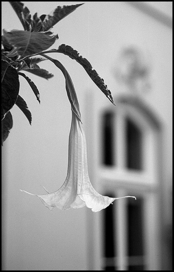
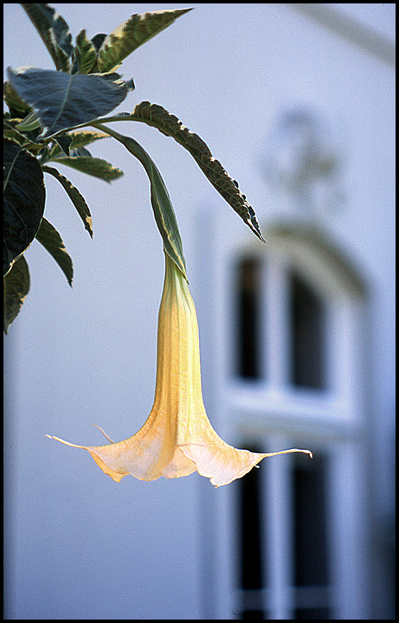
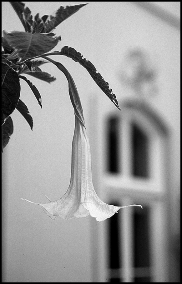
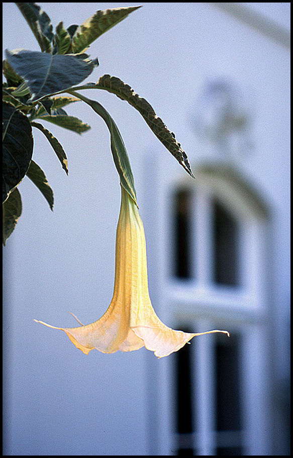
I have a person who wants a 16x20 enlargement from this image
of a Tubeflower in front of the building.
Isn't it interesting - I really am not excited about the image, but
she loves it. So, who am I to argue, correct? 
The quandary is that she can't decide between the black and white
and the color rendition. I told her I would ask some colleagues
and see what they would do.
These are low-resolution 800dpi images. When I scan for
an enlargement, the image will be much cleaner, of course,
with dust spots, grain, etc. fixed. That should not be a problem,
as the transparency is very sharp under the loupe' and will scan
well at 2400dpi, giving about 200ppi for the print. I probably will
work with contrast for the final image, especially if she decides on
the black and white.
Any opinions would be wonderful.
(Taken with the Super-Takumar 55/1.8 at f:3.5 - always a fine lens).
_________________
Assent, and you are sane;
Demur,—you ’re straightway dangerous,
And handled with a chain.
Emily Dickinson
Cameras and Lenses in Use:
Yashica Mat 124 w/ Yashinon 80/3.5,
CV Apo-Lanthar 90/3.5SL, (Thank you Klaus),
Pentax 645,
Flek 50,
Pentax-A 150
Pentax-A 120 Macro
Voigtlander Vitomatic I w/Color Skopar 50/2.8
Konica TC and zoom lenses (thanks Carsten)
Contax AX
Yashica ML 50/2
Yashica ML 35/2.8
Carl Zeiss Contax 50/1.4
Tamron Adaptall SP 17/3.5
Tamron Adaptall 28/2.5
Tamron Adaptall SP 300/2.8 LD (IF)
|
|
| Nach oben |
|
 |
ludoo

Anmeldungsdatum: 18.09.2009
Beiträge: 1397
Wohnort: Milan, Italy
Expire: 2011-12-05
|
Verfasst am: Mi Okt 13, 2010 6:47 pm Titel: |
|
Verfasst am: Mi Okt 13, 2010 6:47 pm Titel: |
|
|
ludoo wrote:
Can't she have both prints, both colour and b&w?
It's a tough call, but I personally prefer the colour one.
_________________
My galleries
Digital: Samsung EX-1
Past Digital: Samsung NX10, Sigma SD9, Sigma SD10, SD14, DP2, Pentax *istD, Kx, Fuji S2 Pro, Canon 5D
Analog: packfilm Polaroids, 6x9 Kodak folders, Pentacon Taxona half-frame, Fujica ST605n, Walz Envoy, Olympus 35 S-II, Olympus Wide S
Past Analog: Polaroid 600se, Polaroid 110B, Canon IIF, various fixed-lens and Russian rangefinders, ...
Past Lenses: Nikkor 24/2.8, Nikkor SC 50/1.4, Nikkor 50/2, Nikkor H 85/1.8, Nikkor P 105/2.5, Nikkor Q 135/3.5, Fujinon 100/2.8, Fujinon EBC 100/2.8, Fujinon EBC 135/3.5, Fujinon EBC 200/4.5, Mamiya SX 135/2.8, CZJ Flektogon 35/2.4, CZJ Pancolar 50/1.8 zebra, CZJ Sonnar 135/3.5, ...
altroformato
|
|
| Nach oben |
|
|
Attila

Anmeldungsdatum: 24.02.2007
Beiträge: 58002
Expire: 2025-11-18
|
Verfasst am: Mi Okt 13, 2010 6:49 pm Titel: |
|
Verfasst am: Mi Okt 13, 2010 6:49 pm Titel: |
|
|
Attila wrote:
| ludoo hat folgendes geschrieben:: |
Can't she have both prints, both colour and b&w?
It's a tough call, but I personally prefer the colour one. |
+1 color one. |
|
| Nach oben |
|
|
shauttra

Anmeldungsdatum: 17.11.2009
Beiträge: 778
Wohnort: Latvia
|
Verfasst am: Mi Okt 13, 2010 6:59 pm Titel: |
|
Verfasst am: Mi Okt 13, 2010 6:59 pm Titel: |
|
|
shauttra wrote:
For this one i prefer colour image. 
_________________
Mto-1000, Tair-3, Auto Exaktar 135mm 2,8, Samyang 14mm 2.8,
Jupiter 37A, Carl Zeiss Sonnar 135/3.5,
Helios-44, Mir-1, Revuenon 50/1.4,
Carl Zeiss Pancolar 50/1.8, Samyang 24/1.4, Auto Vivitar 35/2.8
www.radosi.lv
http://shauttra.blogspot.com |
|
| Nach oben |
|
|
Laurence
Anmeldungsdatum: 26.03.2007
Beiträge: 4809
Wohnort: Western Washington State
Expire: 2016-06-19
|
Verfasst am: Mi Okt 13, 2010 7:01 pm Titel: |
|
Verfasst am: Mi Okt 13, 2010 7:01 pm Titel: |
|
|
Laurence wrote:
| ludoo hat folgendes geschrieben:: |
Can't she have both prints, both colour and b&w?
It's a tough call, but I personally prefer the colour one. |
I actually think she is going to buy one print now, and the other version
in a few months. But of course, I would like to give her the one that
has a consensus from this forum, as well as a couple of her friends.
Thank you!
_________________
Assent, and you are sane;
Demur,—you ’re straightway dangerous,
And handled with a chain.
Emily Dickinson
Cameras and Lenses in Use:
Yashica Mat 124 w/ Yashinon 80/3.5,
CV Apo-Lanthar 90/3.5SL, (Thank you Klaus),
Pentax 645,
Flek 50,
Pentax-A 150
Pentax-A 120 Macro
Voigtlander Vitomatic I w/Color Skopar 50/2.8
Konica TC and zoom lenses (thanks Carsten)
Contax AX
Yashica ML 50/2
Yashica ML 35/2.8
Carl Zeiss Contax 50/1.4
Tamron Adaptall SP 17/3.5
Tamron Adaptall 28/2.5
Tamron Adaptall SP 300/2.8 LD (IF)
|
|
| Nach oben |
|
|
Laurence
Anmeldungsdatum: 26.03.2007
Beiträge: 4809
Wohnort: Western Washington State
Expire: 2016-06-19
|
Verfasst am: Mi Okt 13, 2010 7:02 pm Titel: |
|
Verfasst am: Mi Okt 13, 2010 7:02 pm Titel: |
|
|
Laurence wrote:
Attila and shauttra: Thank you! Looks like color is leading already!
_________________
Assent, and you are sane;
Demur,—you ’re straightway dangerous,
And handled with a chain.
Emily Dickinson
Cameras and Lenses in Use:
Yashica Mat 124 w/ Yashinon 80/3.5,
CV Apo-Lanthar 90/3.5SL, (Thank you Klaus),
Pentax 645,
Flek 50,
Pentax-A 150
Pentax-A 120 Macro
Voigtlander Vitomatic I w/Color Skopar 50/2.8
Konica TC and zoom lenses (thanks Carsten)
Contax AX
Yashica ML 50/2
Yashica ML 35/2.8
Carl Zeiss Contax 50/1.4
Tamron Adaptall SP 17/3.5
Tamron Adaptall 28/2.5
Tamron Adaptall SP 300/2.8 LD (IF)
|
|
| Nach oben |
|
|
Orio

Anmeldungsdatum: 24.02.2007
Beiträge: 29545
Wohnort: West Emilia
Expire: 2012-12-04
|
Verfasst am: Mi Okt 13, 2010 7:45 pm Titel: |
|
Verfasst am: Mi Okt 13, 2010 7:45 pm Titel: |
|
|
Orio wrote:
I vote for colour, because there isn't enough tones separation in the B&W image to make the flower look separated from the building.
Of course this might change with some specific digital darkroom work on the separate colour channels - but as it is, colour is much preferable IMHO.
_________________
Orio, Administrator
T*
NE CEDE MALIS AUDENTIOR ITO
Ferrania film is reborn! http://www.filmferrania.it/
Support the Ornano film chemicals company and help them survive!
http://forum.mflenses.com/ornano-chemical-products-t55525.html |
|
| Nach oben |
|
|
cooltouch

Anmeldungsdatum: 15.01.2009
Beiträge: 9096
Wohnort: Houston, Texas
|
Verfasst am: Mi Okt 13, 2010 7:54 pm Titel: |
|
Verfasst am: Mi Okt 13, 2010 7:54 pm Titel: |
|
|
cooltouch wrote:
Well, I don't often wish to argue with Orio, but this time I'm gonna disagree. I think there is sufficient difference in textures between the flower and the out-of-focus background such that a B&W image will work, especially if you punch up the contrast a bit, as you mentioned. But if I were buying, I'd go for the color image. That's just me, though -- I almost always prefer a color image to a B&W one, given a choice between the two. This one especially, though. You've got a nice gradient from unsaturated to saturated (top to bottom) with the background and just the reverse of saturated to unsaturated from top to bottom with the flower. This contrast makes the color photo quite interesting.
Course, if you've got a Costco in your area, you might offer here a twofer. Their print prices are remarkably cheap and they do decent work.
_________________
Michael
My Gear List: http://michaelmcbroom.com/photo/gear.html
My Gallery: http://michaelmcbroom.com/gallery3/index.php/
My Flickr Page: https://www.flickr.com/photos/11308754@N08/albums
My Music: https://soundcloud.com/michaelmcbroom/albums
My Blog: http://michaelmcbroom.com/blogistan/ |
|
| Nach oben |
|
|
|
|
|
Du kannst keine Beiträge in dieses Forum schreiben.
Du kannst auf Beiträge in diesem Forum nicht antworten.
Du kannst deine Beiträge in diesem Forum nicht bearbeiten.
Du kannst deine Beiträge in diesem Forum nicht löschen.
Du kannst an Umfragen in diesem Forum nicht mitmachen.
|
 Deutsch
 Español
 中文
 Magyar
 Русский
 日本語
 Français